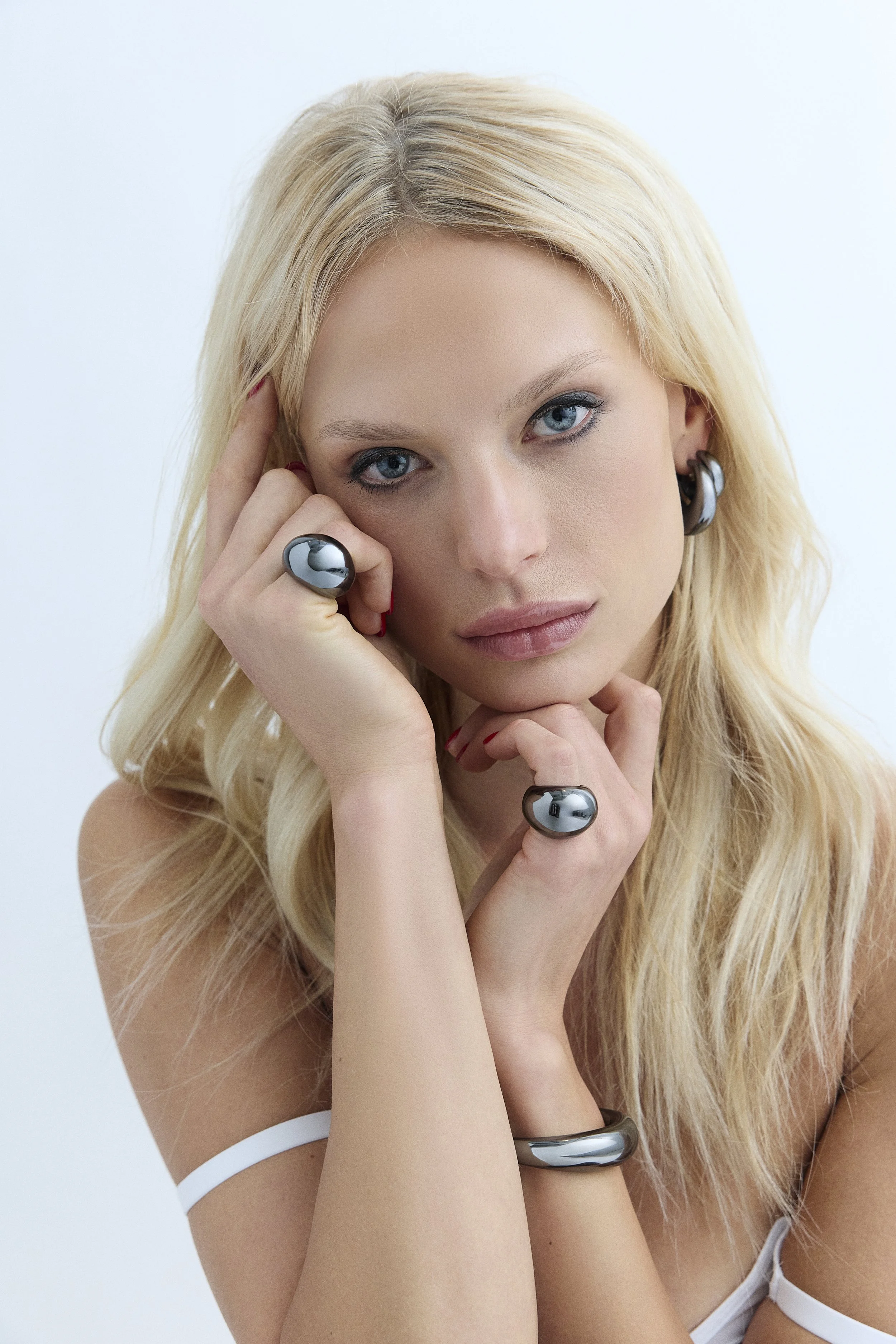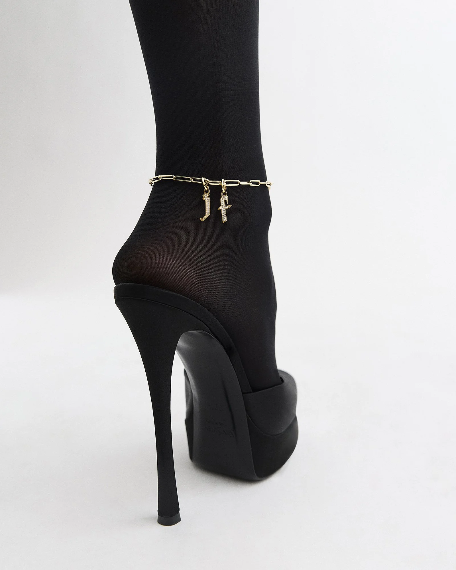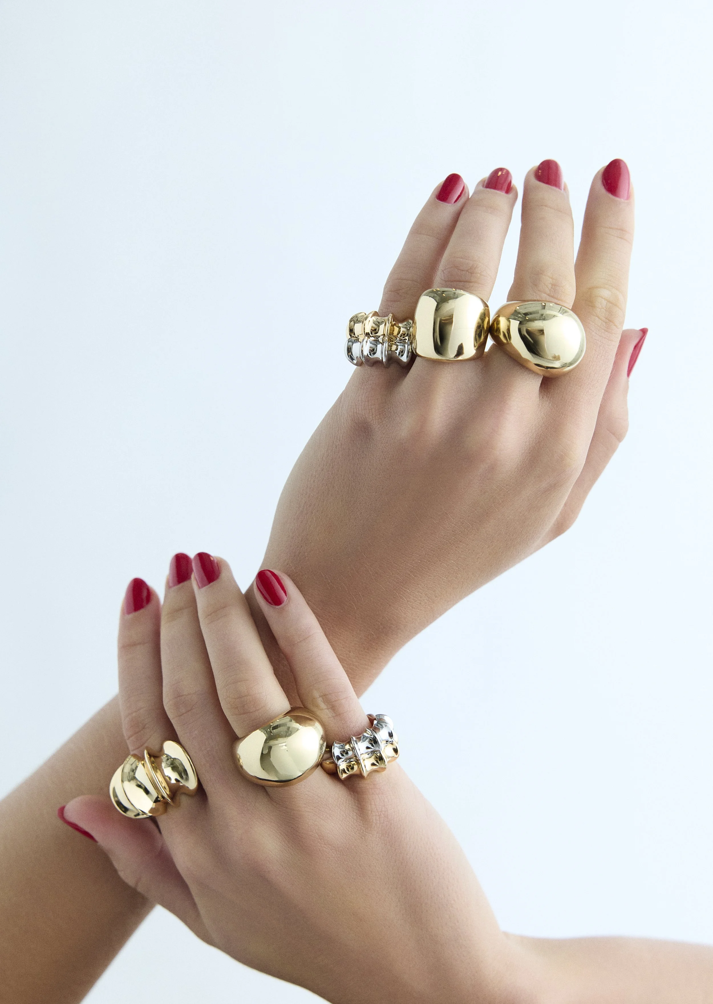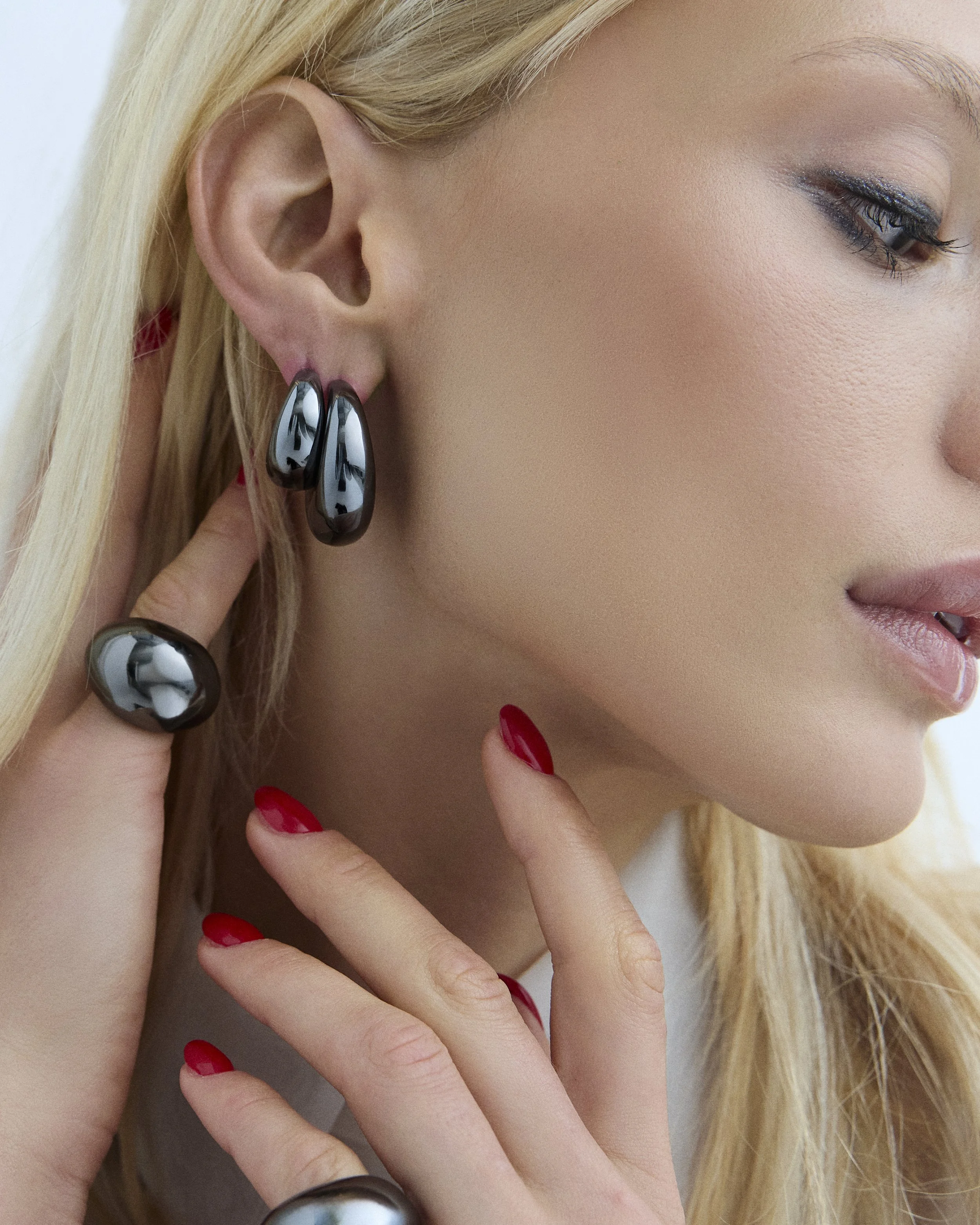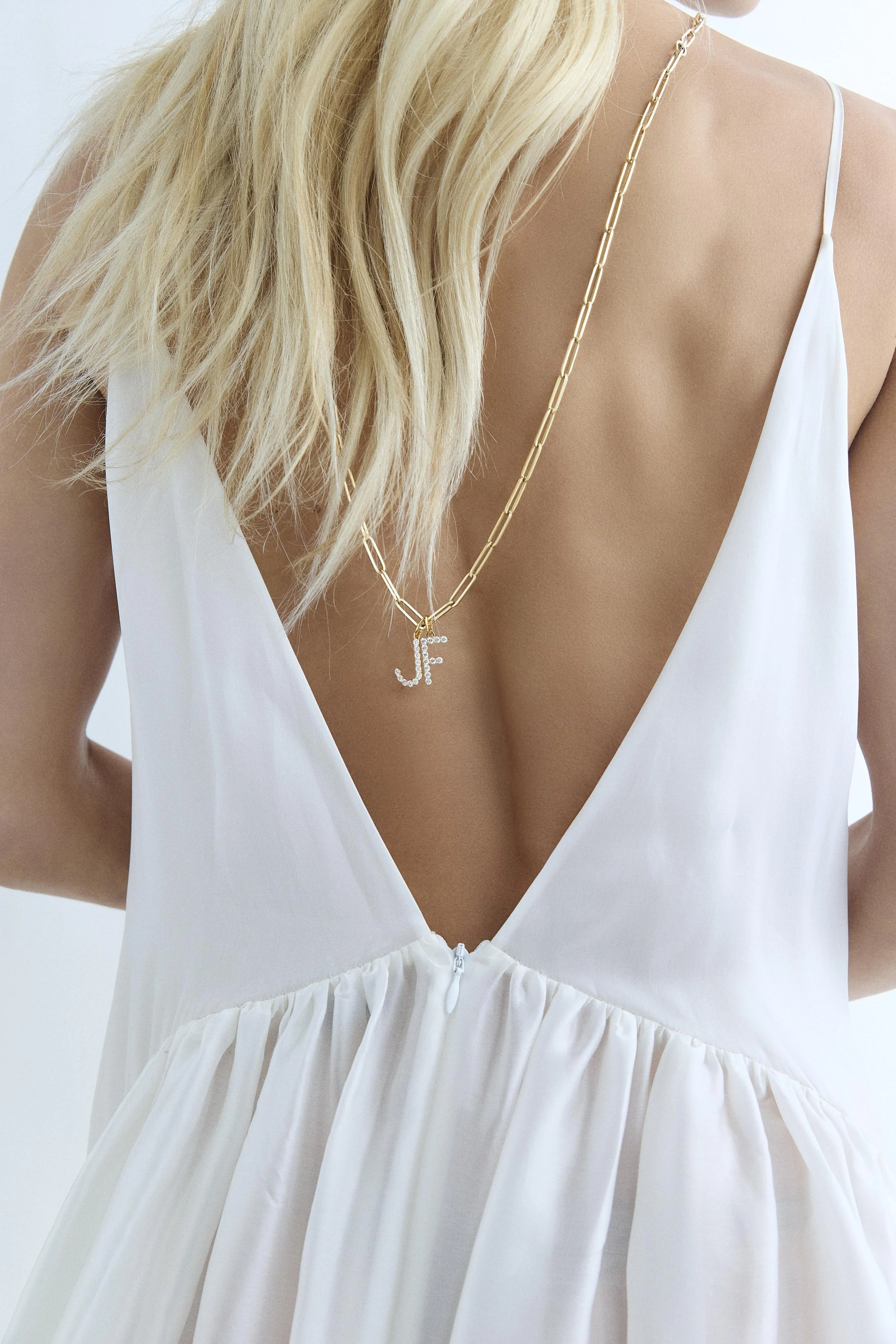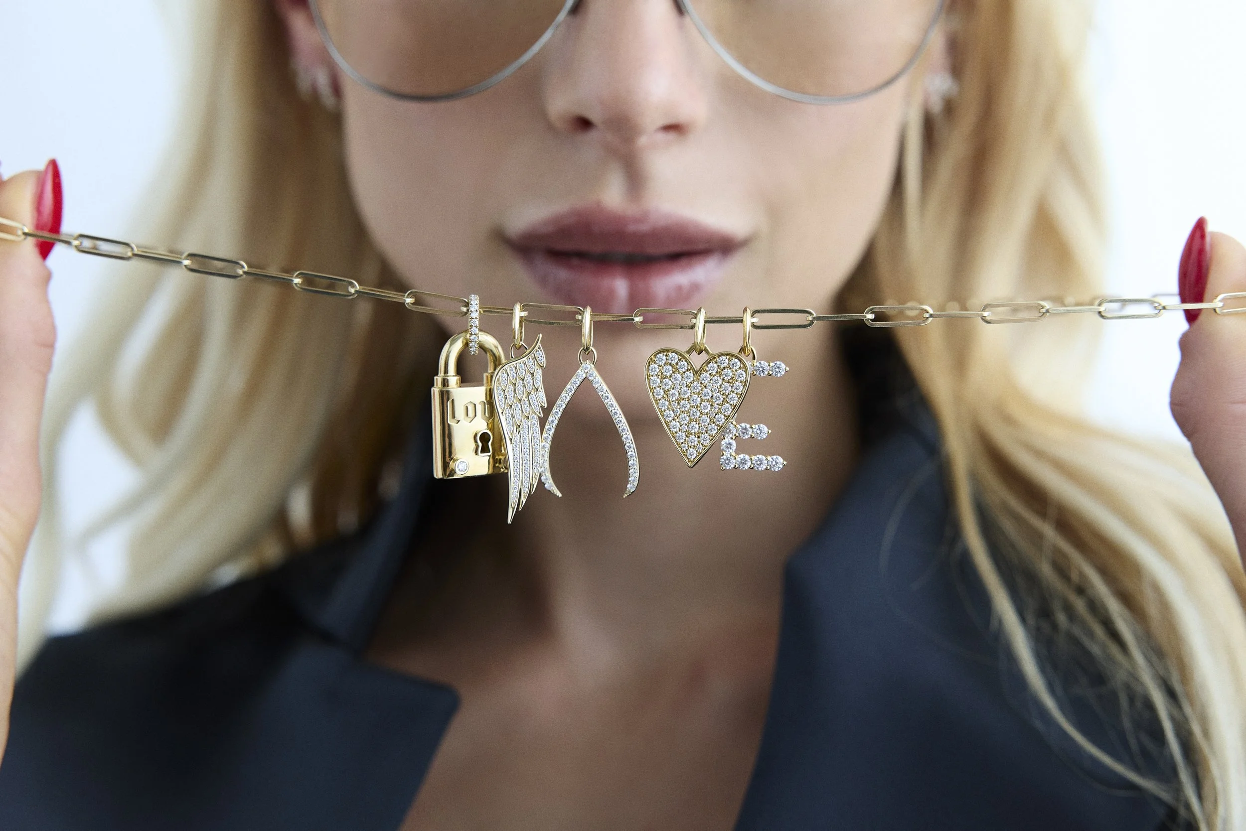
The Jennifer Fisher Fall ’25 Campaign tells the story of a working woman. The character is inspired by Jennifer Fisher, the brand Creative Director. She is powerful and direct. She calls the shots and takes no bullshit.
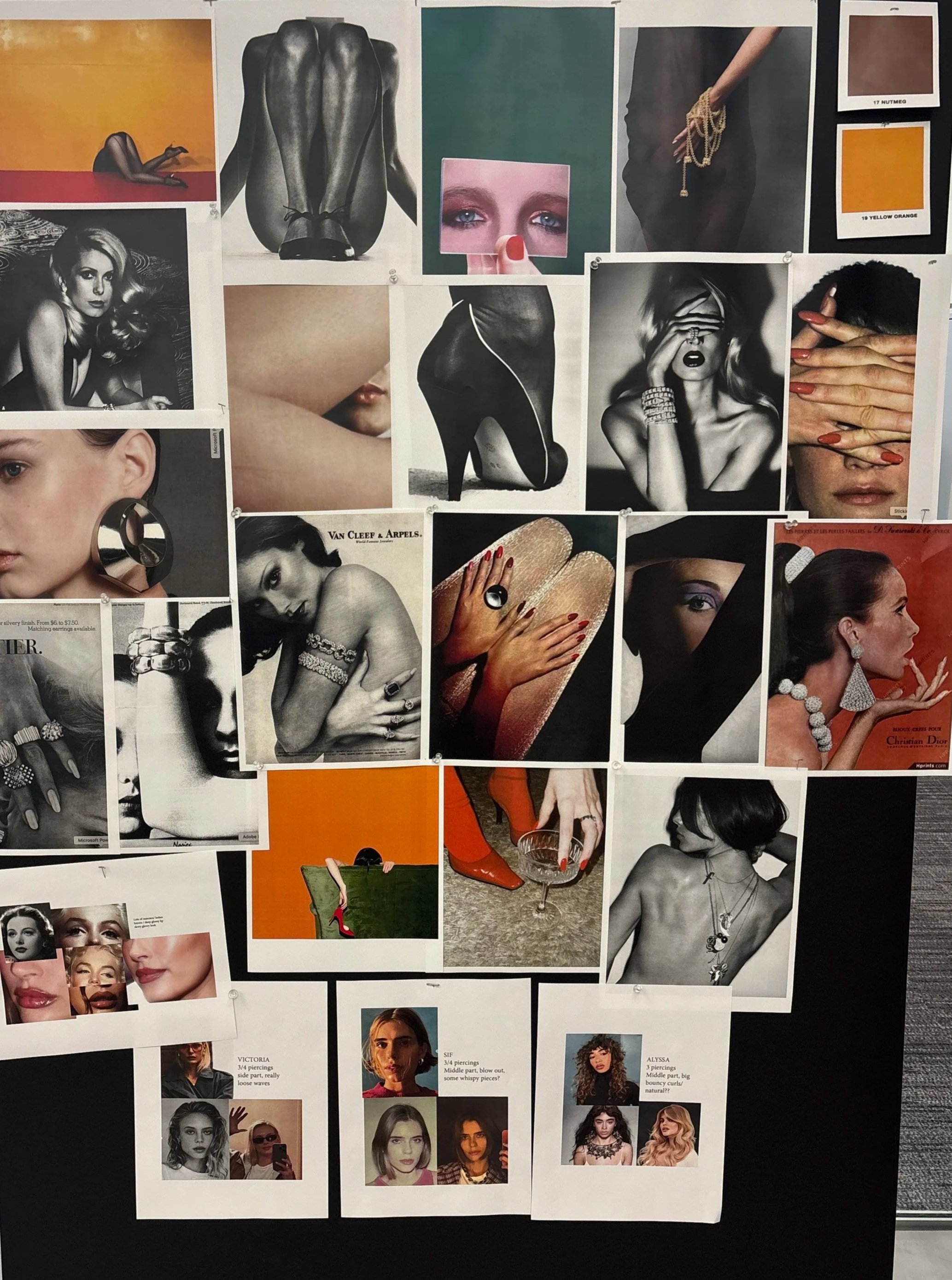
The visual language centers on mirrors, sheer layered fabric, tights, and an intentional presence of skin paired with dramatic eye makeup for. Modeling direction emphasizes strength and presence through angular posing and assertive body language. Lighting remains soft and sculptural to shape and define without creating harsh edges, adding depth and elegance to the scene.
Inspired by bold fashion photographers such as Guy Bourdin, Helmut Newton, and Steven Klein, the intention of this campaign was to to celebrate 20 years of the brand through an editorial lens.
The Moodboard:
The Result In Video:
The Result In Images: